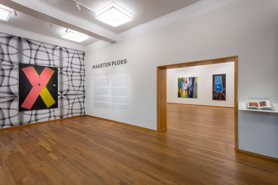
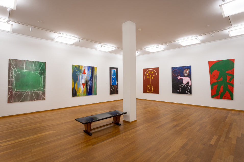
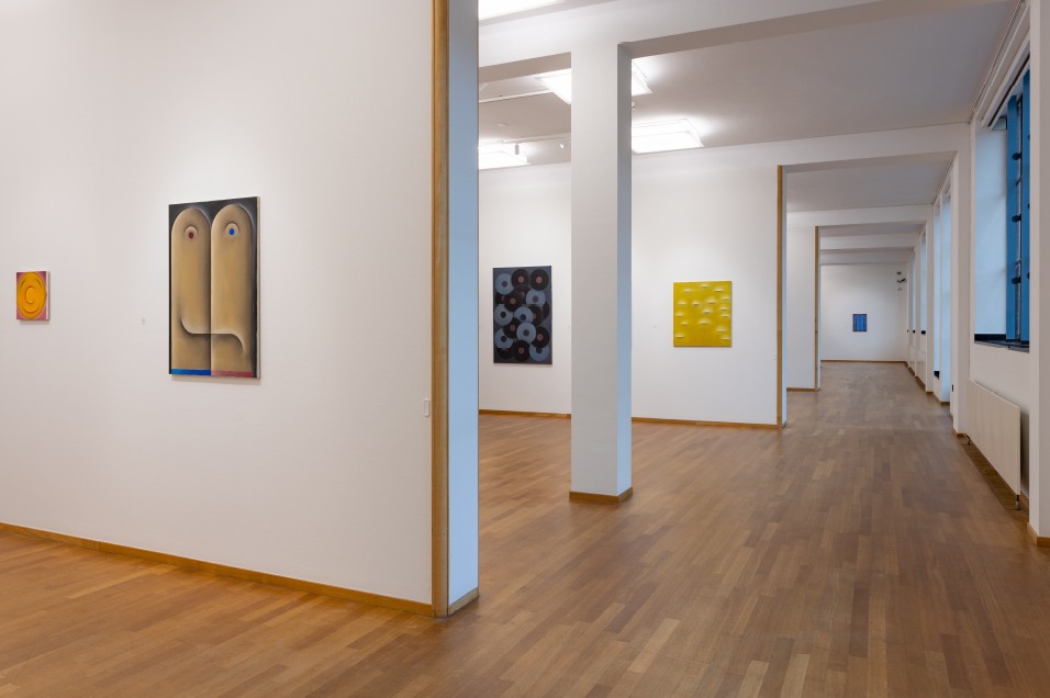
Maarten Ploeg
BENNO TEMPEL
I have to write lyrics
[Maarten Ploeg, note in Sketchbook G-58]
but it’s a misery
I’d rather draw
This text accompanies the exhibition Maarten Ploeg at the Kunstmuseum Den Haag
from 25 February to 11 June 2023, curated by Benno Tempel and assisted by Renée Volkers.
The Kunstmuseum Den Haag is proud to organise the first major survey of works by Maarten Ploeg (1958-2004) since his untimely death in 2004. From time to time, the Kunstmuseum hosts exhibitions of Dutch or foreign artists who have broken free to some extent from the canon, or who have received little attention in the Netherlands. Not infrequently these are artists who emerged in the 1980s.[1]
Ploeg’s oeuvre is still underexposed, while it contains all the elements for him to be counted among the most important artists of his generation. In 1982, at the age of twenty-four, Ploeg was a recipient of the Royal Subsidy for Painting (now the Royal Award for Modern Painting), which aroused considerable interest in his work. Two years later, he exhibited at the Kunstmuseum Den Haag (then the Haags Gemeentemuseum), which also acquired his work for the permanent collection. In 1985 he received the Prix de Rome Basic Prize for Painting. During the same period, Ploeg also caused a furore as a member of the pop bands Soviet Sex, Blue Murder and Astral Bodies, whose music videos stood out for their artistic quality at a time when the medium was still in its infancy. Like a Dutch David Byrne, Ploeg combined art and music with a charismatic personality. Although many Dutch artists were involved in music in some way in that period, Ploeg had an extended musical career, releasing albums and videos, and performing live.
Despite this success, Ploeg’s work is barely visible today, largely absent from most museums of modern art of the Netherlands’ (in addition to the works in the collection of the Kunstmuseum Den Haag, the Stedelijk Museum in Amsterdam has two paintings and more than forty video works for Park 4DTV, and in 2020 the Rijksmuseum in Amsterdam acquired a painting as part of a gift from the collection of Pieter and Marieke Sanders.) Despite the fact that the 1980s was an exciting decade, in which painting was given a new vitality and Dutch art attracted international attention, exhibitions about artists from this period are rare in the Netherlands.[2] Today, only a handful of Dutch artists from the 1980s are known to the general public and, unfortunately, no comprehensive art-historical study of this period has yet been carried out.
In this text, I will briefly discuss a number of characteristics of Maarten Ploeg’s work in the hope that it will provide an impetus for a more detailed study of Dutch art of the 1980s and Ploeg’s significance within it.[3]
The 1980s
The 1980s were marked by political, economic and social turbulence, with massive unemployment, squatters’ riots and, later in the decade, the materialistic greed of the emerging class of yuppies (young upwardly mobile professionals). These changes were reflected in the art of painting. What can be said about these developments – in the Netherlands alone – is so extensive that we must restrict ourselves here to a broad outline.
Following the abstract, Minimal and Conceptual art of the 1960s and the performance and video art of the 1970s, the 1980s saw the unexpected return of figurative painting. The reasons for this development have already been described elsewhere.[4] It was also the last decade before the emergence of the current digital era in the 1990s. The art of the 1980s was characterised by contradictions: it was both alternative and established, ironic and serious, idealistic and commercial, gritty and sterile. Much of the painting produced during these years was figurative. The decade began with Neo-Expressionist paintings with strong contrasts of colour and violent, gestural use of paint.
Painting dared to be figurative once again. There was a real hunger for images and a rejection of all-encompassing theories and grand narratives.[5] Many artists employed a visual language of poetic mystery. In contrast to the ‘less is more’ philosophy that dominated in the 1960s and 1970s, artists now embraced the American architect Robert Venturi’s adage ‘less is a bore’. Internationally, the emergence of Neo-Expressionism from the late 1970s gave rise to a broad movement that was known by a variety of names: Neue Wilde in Germany, Transavantguardia in Italy and Nieuwe Wilden in the Netherlands.
During the course of the 1980s, Neo-Expressionism gave way to Postmodernism, a movement in which anything and everything could be combined, with images quoted from art history and popular visual culture. The postmodernists fused a variety of styles, leading to a levelling of the modernist value system: artists were free to combine imagery as they pleased.
Ploeg was one of the youngest artists of that generation. Initially he worked in a Neo-Expressionist style influenced by the latest German painters. In his student years, he exhibited paintings with bright colours and wild brushwork. With these works, Ploeg can be seen as one of the representatives of the Nieuwe Wilden in the Netherlands.
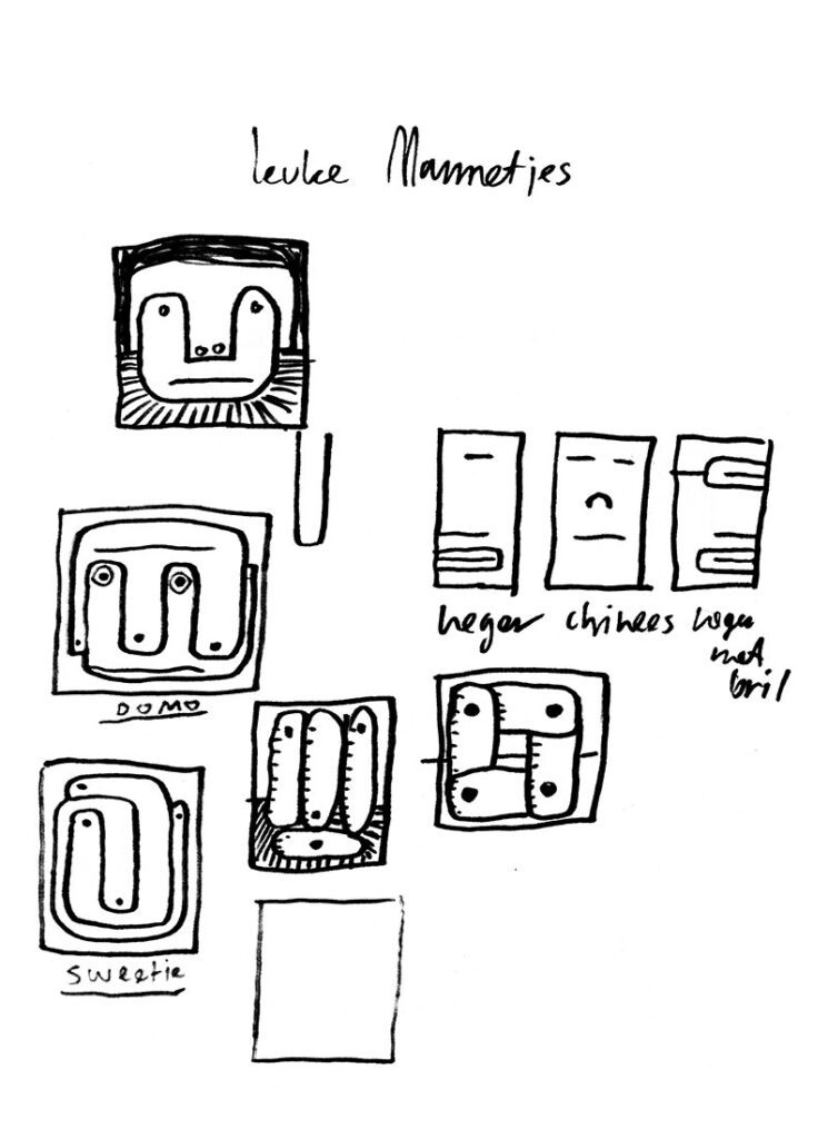
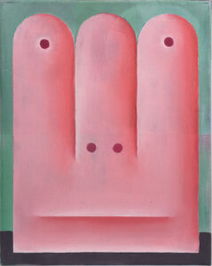
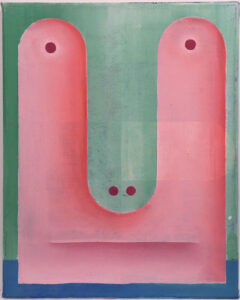
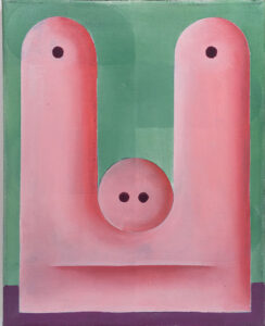
Later he developed a highly personal and richly imaginative visual language. Faces emerge from almost monochrome surfaces: sparingly applied stripes and circles form rudimentary eyes, a nose and a mouth. Using such apparently simple motifs, Ploeg built a rich oeuvre that is both layered and humorous, expressing a playful pleasure in the inventive way in which he succeeded in suggesting a landscape, human figure or animal in an abstract composition. The digital forms he later discovered in his computer art also influenced his painting. In contrast to the prevailing trend at the time, his work became more abstract and contained elements of early-twentieth-century avant-garde movements such as De Stijl, Cubism and Suprematism. However, Ploeg never managed to achieve complete abstraction in his painting. As he admitted at the time, a face always somehow krept it.
MAARTEN PLOEG
Below we examine Ploeg’s oeuvre in terms of seven aspects – technique, language, abstraction, transformation, humour, references and computers – that played an important role in his work. This reveals the characteristics of his oeuvre and the position that he occupied in Dutch art in the 1980s. For the organisation of this exhibition at the Kunstmuseum Den Haag, we were given access to Ploeg’s sketchbooks, which contain several missing pieces of the puzzle that partly clarify the artist’s intentions and motives.
TECHNIQUE
Ploeg initially painted in the Neo-Expressionist style that was fashionable in the early 1980s. This brought him instant success. He won the Royal Subsidy for Painting in 1982 and, together with Peter Klashorst (1957), employed a degree of swagger to get media attention, including in a VPRO television programme.[6]
As with many artists of the period, his working method expressed a punk mentality. This do-it-yourself inventiveness is especially evident in his early work, in which he used unconventional materials. He initially rejected the ‘nobility’ of oil paint in favour of acrylic paint sprayed directly from an aerosol can. And he used curtain fabric as the canvas for some of his expressive paintings, partly because of a lack of money, but undoubtedly also because of the rebellious effect that chimed with the punk mentality.
However, Ploeg soon abandoned Neo-Expressionism in favour of more-or-less-monochrome canvases in delicate colours, in which abstracted faces appear, made up of a few lines and dots. These works also signalled a shift from acrylic to oil paint. The transition from his wild, expressionistic phase to the more thoughtful and, due to their darker palette, more melancholy ‘large heads’ from around 1984 seems to have been abrupt. However, Ploeg did not abandon his DIY mentality. He continued to use unorthodox tools to create his paintings. Cut-out cardboard templates served to separate the different areas of colour from each other during the making process. In many works, the imprint of the template is still visible. He also uses lids or caps to trace circles. Some canvases exhibit pentimenti of underlying scenes that have been painted over. All these elements give his paintings an uncompromising character.
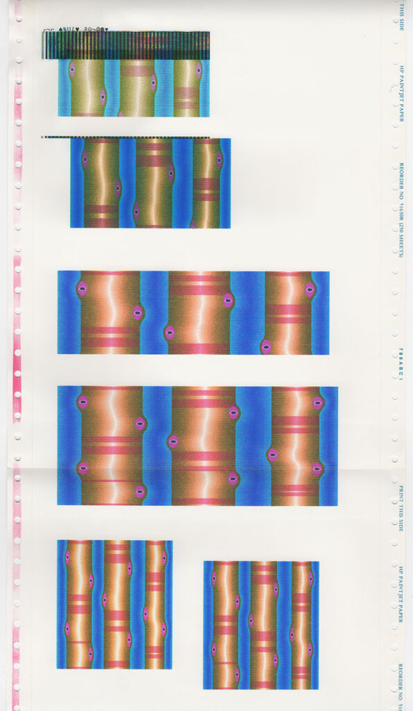
Around 1994-95 stamping and working with templates returned in the series of figures that exhibit a kinship with the playing field of the computer game Pacman. These abstract, complex ‘sausage men’ are also reminiscent of an aesthetic that we know from graffiti art. Many of Ploeg’s works are based on the three colours that make up a television image: red, green and blue. In this respect, the layer of meaning in his paintings also extends to the technique and working method and the choices the artist made.
Ploeg described his attitude as Artificial Stupidity. The idea behind this concept reveals a characteristic Ploegian logic. The path to artificial intelligence is through artificial stupidity: you must know and embrace your limitations before you can excel.[7] This also makes it easy to understand how Ploeg developed further from the punk mentality. He remained interested, inventive and curious and was open to others, something that is evident from his intense social involvement with other artists. He regularly took a step back to give others space.
LANGUAGE
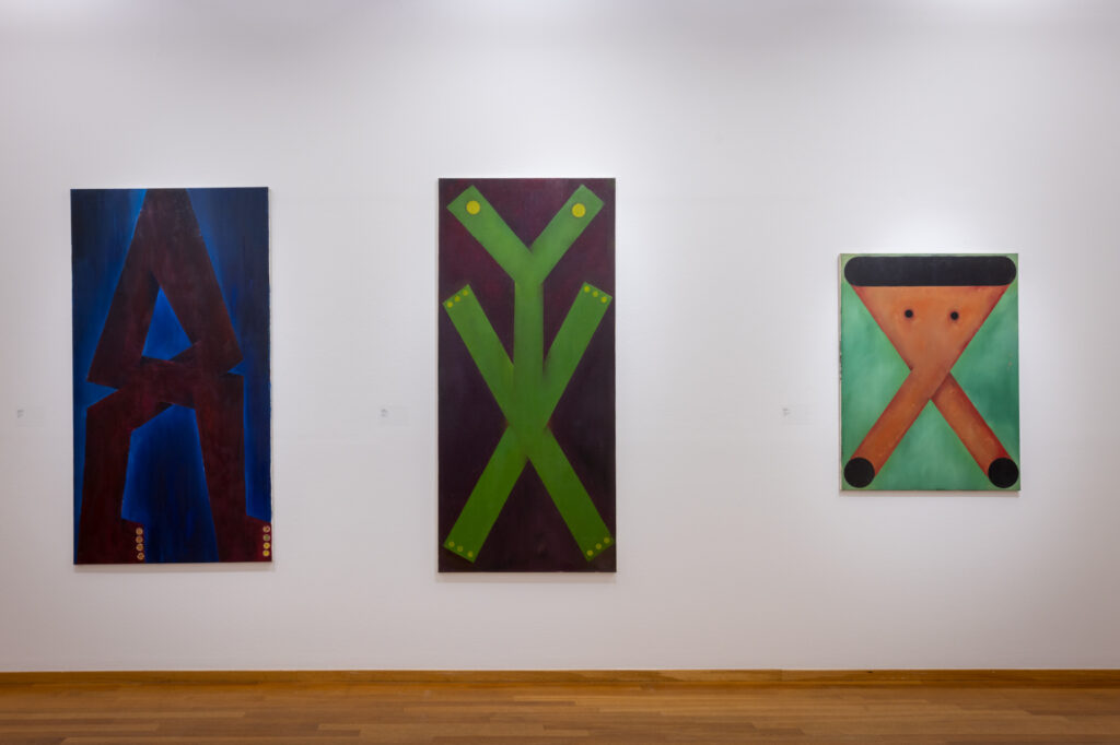
It is interesting at this point to take a moment to reflect on the work of the René Daniëls (1950), a painter who is seen as a defining figure in Dutch art of the 1980s. Language is an important element in his work and also played an important role in Ploeg’s oeuvre.[8] Both artists often played with visual rhymes between different paintings, and both employed texts in their paintings. The linguistic element in Daniëls’ work is found largely in the non-visual elements, especially in the titles, often creating a discrepancy between image and title.[9] In a number of works he includes words or sentences, but they are nearly always the title of the work. In that sense, the text adds little meaning to the title and the image. With Ploeg, language, often in the form of a letter, becomes part of the image. Indeed, it often defines the image. Where Daniëls deliberately gave his works titles that are enigmatic or sometimes even pretentious, Ploeg was, above all, disarmingly simple and ironic.[10]
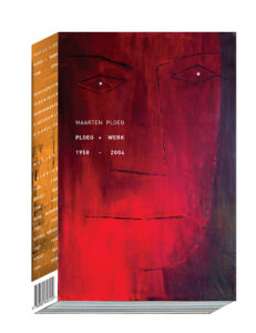
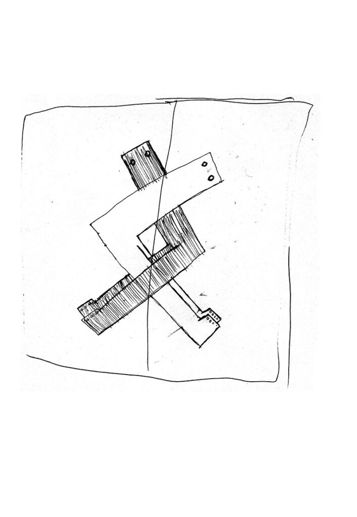
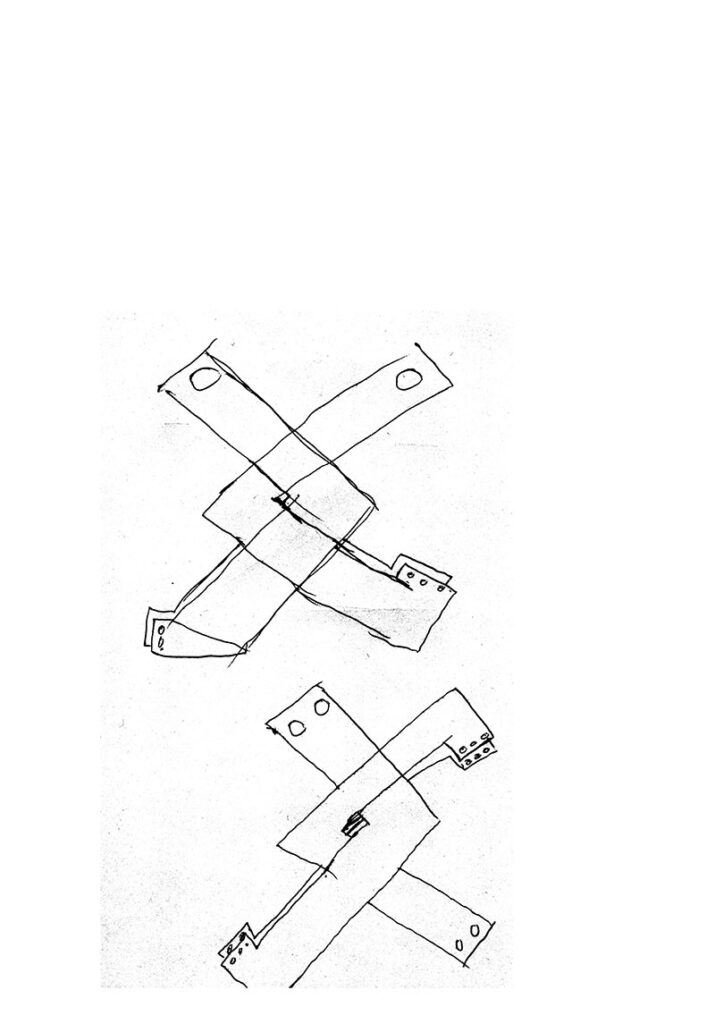
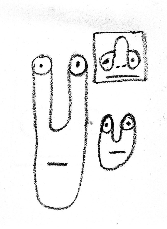
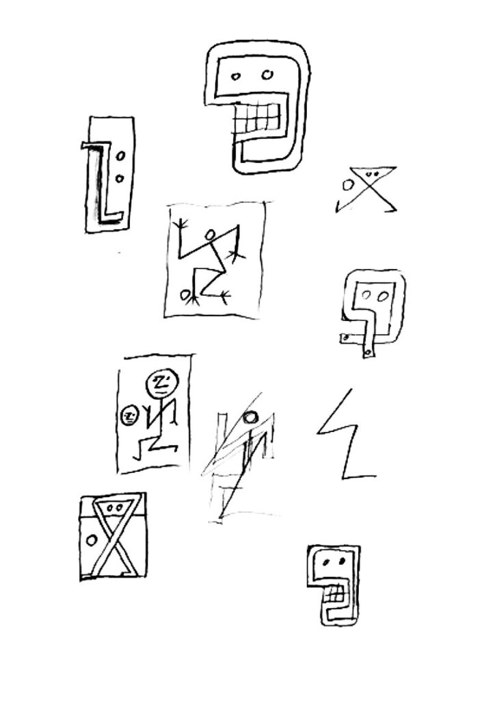
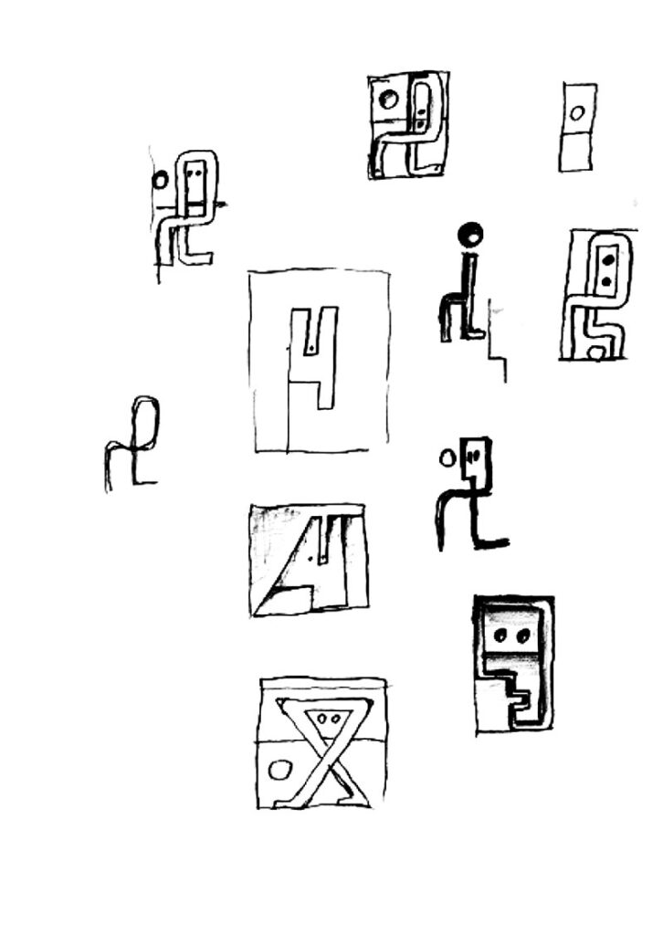
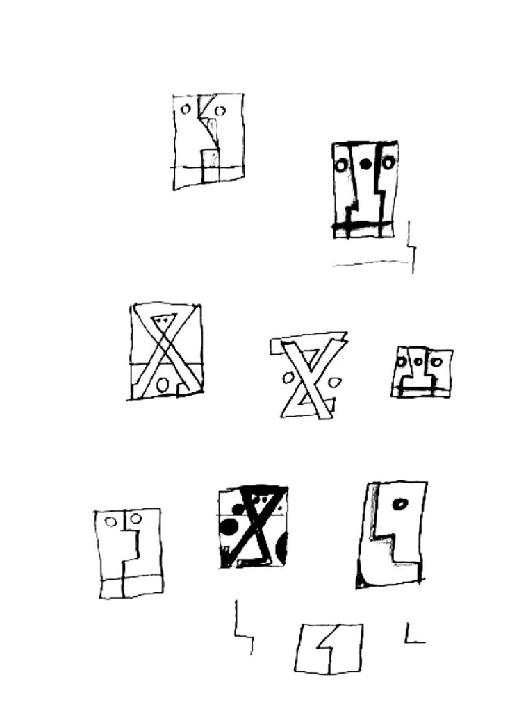
Daniel’s work derives its ambiguity through a stacking of image-meanings within a single painting, creating a dreamlike effect that is so characteristic of painting of the 1980s.[11] By contrast, often opted for a powerful, at first glance, unambiguous image. Where Daniëls’ work is characterised by narrative, Ploeg’s images are illusionistic. Ploeg addressed language in several ways in his work. First of all, there are the ‘large heads’ from 1983-84, in which parts of the face sometimes consist of a letter, for example a nose formed by a large Z. In a triptych from 1984, the faces of the individual works are formed by two circles for the eyes and an X, a Y and a Z for the noses (ill. p. 245). In 1984, Ploeg began the so-called alphabet paintings, in which ‘letter men’ are a fusion of a letter and a human figure, of abstraction and figuration. One canvas combines an X and a Y, which merge into a figure that seems to be in dire need. In another, a mouth consisting of an A and a Z is connected by a long, horizontal line. Sometimes the letters form a word, such as ‘IK’ (Dutch for I) or ‘OK’. Gradually, Ploeg developed an inventive and playful working method in which he created complex shapes that are sometimes letters and sometimes form a name and a landscape or an almost cosmic image (e.g., ill. p. 258). Two good examples of this practice are the etching that seems to form the name ‘Maarten Ploeg’ and a painting in which a capital R becomes a sad face. (ills. pp. 256 and 257)
ABSTRACTION
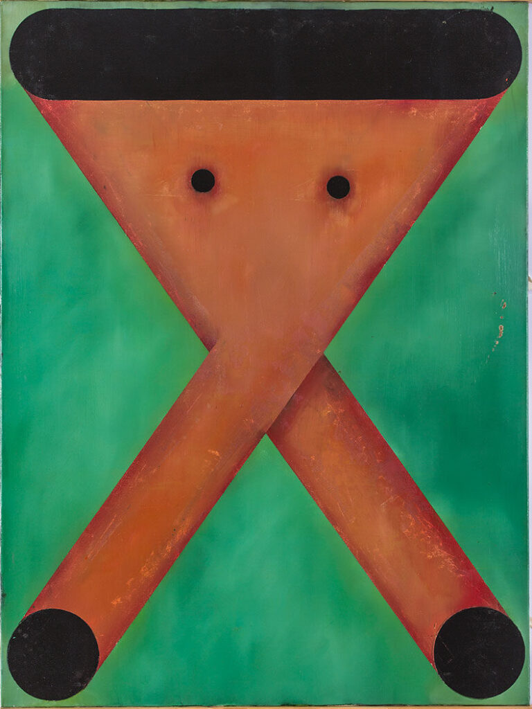
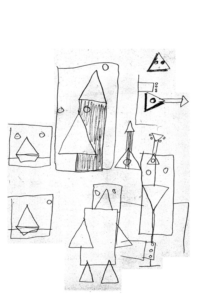
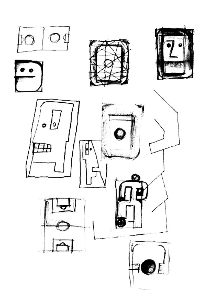
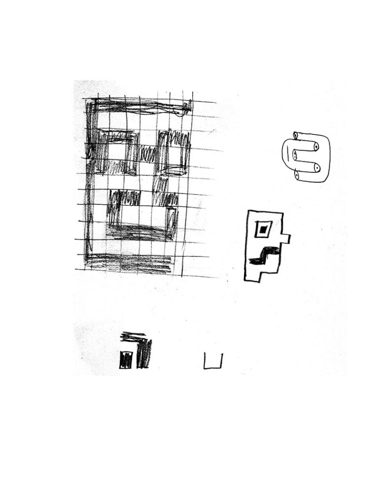
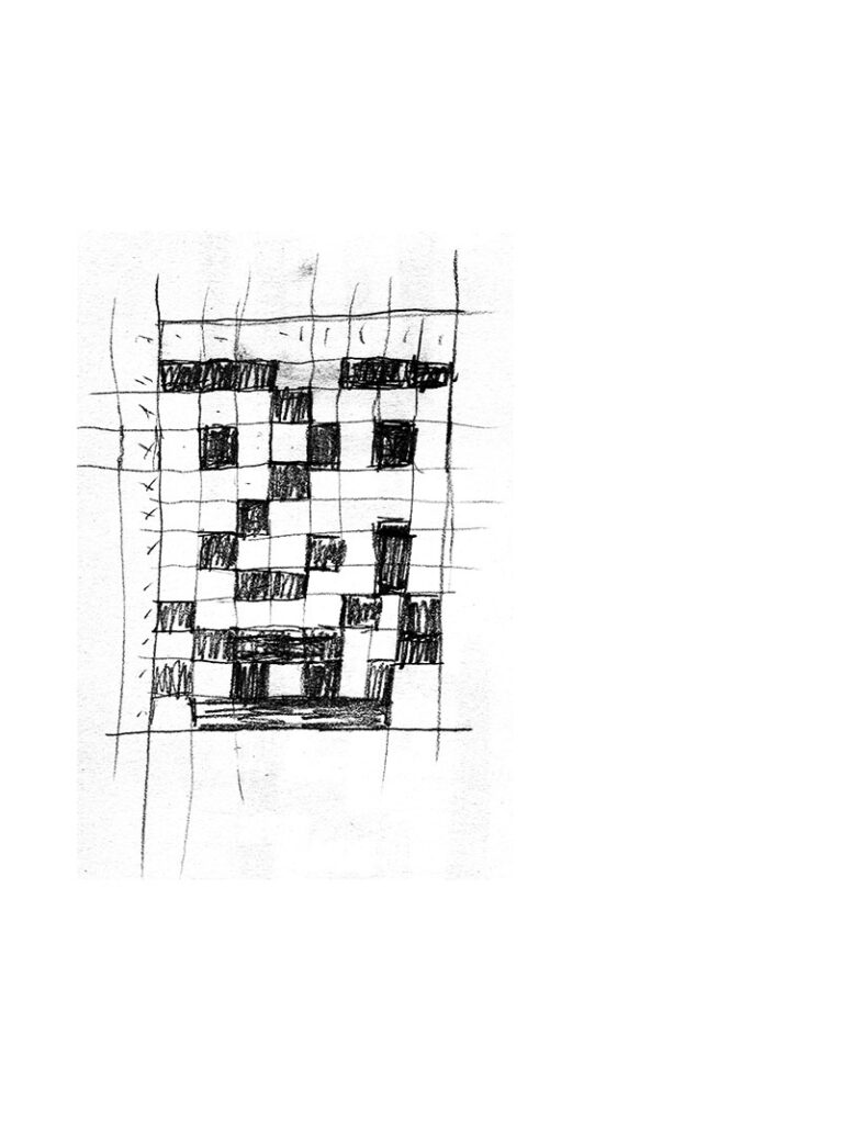
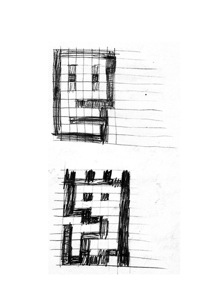
Ploeg’s position with regard to abstract art differed greatly from the serious, formal approach of the 1960s and 1970s. Here, too, his attitude can be described as artificial stupidity, in which he approached abstraction in a playful, ironic and inventive way. Like the first generation of abstract artists, Ploeg took figuration as a starting point and then simplified and abstracted the motifs. These steps are easy to follow in his sketchbooks (e.g. SB D 34-35, 54-56).
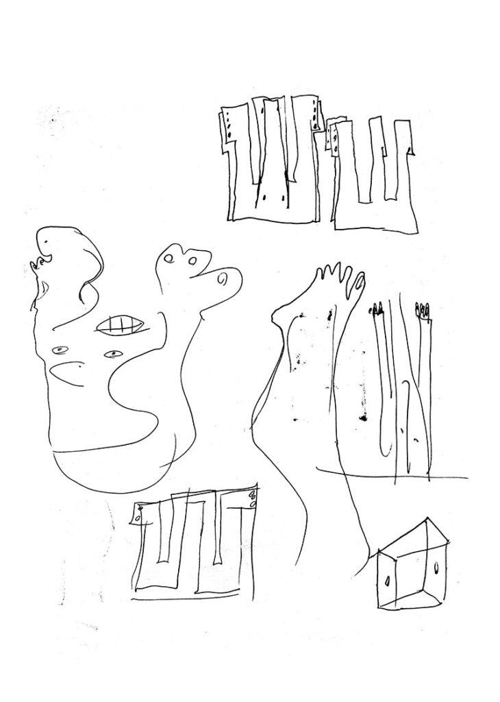
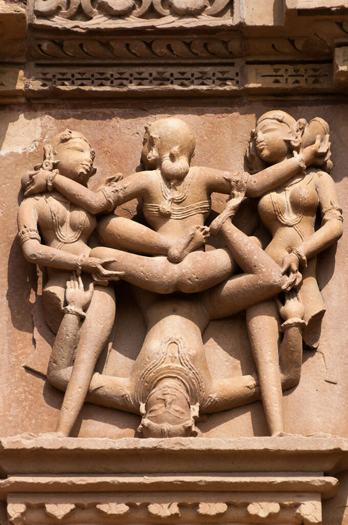
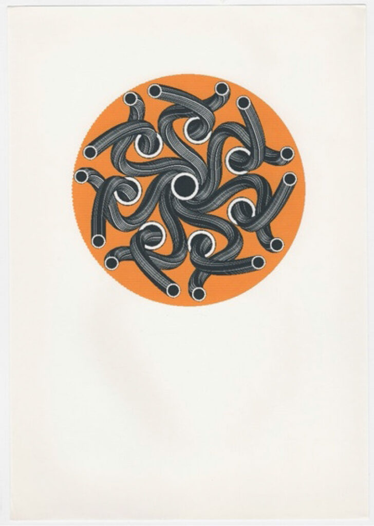
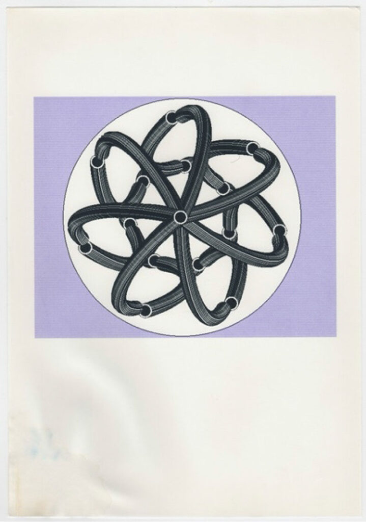
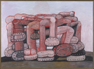
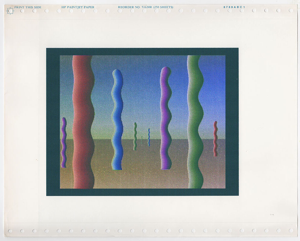
The boundary between figuration and abstraction becomes blurred. At first glance, these paintings are abstract compositions that appear to change into figures and (self)portraits or occasionally an animal or a landscape (sketch – 28). In addition to abstract works in which the figurative element emerges naturally and forms a face, there are also paintings in which Ploeg used more decorative forms, some originating from ancient cultures, such as the Indian sauwastika (the anticlockwise form of the swastika). This led to a series of paintings with men made up of sausages or tubes. The abstract forms are reminiscent of the flexible limbs in the famous reliefs in the temple complexes of Angkor Wat in Cambodia or Khajuraho in India. Ploeg will no doubt have appreciated that it also had a sexual connotation.
The advent of the Amiga computer enabled Ploeg to work on his abstraction in a different way. His computer prints exhibit overlaps with patterns such as those found in ancient cultures such as the Incas or the Islamic world, or with modern artists such as M.C. Escher (1898-1972), Anni Albers (1899-1994) and Josef Albers (1888-1976) (see computer prints 33, 34 and 36). This interest in the world of illusion, tessellation and infinite patterns was also reflected in his enthusiasm for the exhibition Anamorphoses (1976) at the Rijksmuseum in Amsterdam.
That figuration, abstraction and the digital image were inextricably linked for Ploeg is clear from one of his sketchbooks in which he created a kind of matrix that outlines a development ‘from abstract via digital to real to nothing’:
| Show | ||||
| from abstract | via digital | to real | to nothing | |
| ↓ | ↓ | ↓ | ↓ | |
| blocks | photocopy | photo | white | |
| dots | infrared | film | light | |
| stripes | digitised | |||
| dark | ||||
underexposed | overexposed | |||
| | black | purple | | green | | yellow | | white | |
| | red | ||||
| | blue |
TRANSFORMATION
Closely connected with abstraction and tessellation is the principle of transformation. The first abstract ‘heads’ can already be seen as a transformation. And in the Alphabet paintings, do we see letters that become figures, or are they figures that transform into letters? Transformation is an important characteristic of Ploeg’s work and is evident in various phases of his oeuvre.
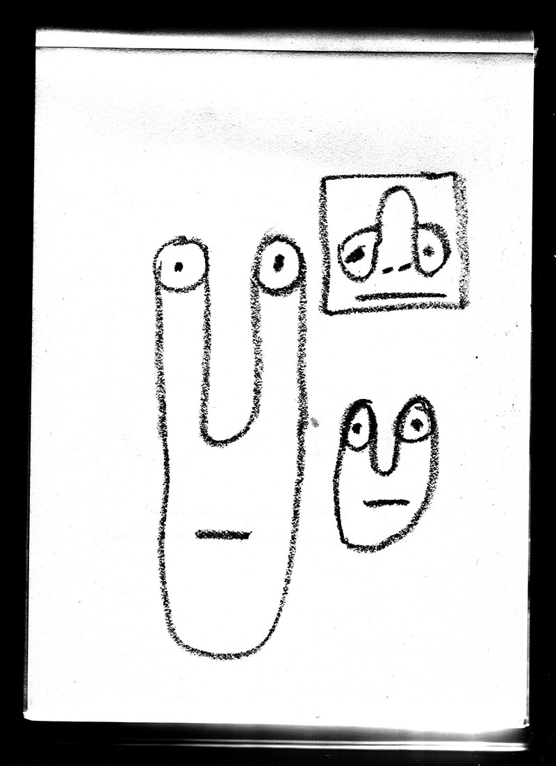
Once our eye is attuned to them, we see the transformations everywhere. The imagery in some of the Puzzle paintings from 1988 looks suspiciously like maps (of the Netherlands, for example) or a labyrinthine street plan. We see arms that also serve as the hands of a clock, and circles that form a clown’s nose. One of Ploeg’s sketchbooks contains images that have multiple possible interpretations: a face that could also be a church steeple, and another that resembles a house or a haystack (à la Monet) (fig. SB D-49). Images of LPs take on an almost cosmic appearance in their allusion to the solar system. As images are inverted, meanings shift: noses that point up or down can be, ambiguously, either a facial feature or a penis (e.g. SB F 26).
The simpler, the more convincing. For example, an abstract composition of a horizontal line surmounted by a circle becomes a landscape with a sun (SB G 08). While another landscape can transform just as easily into an angry face. And then there are the sexual references to breasts, buttocks or penises. Ploeg wittily painted fused faces that also read as a sandwich, and, with biting irony, a canvas entitled Self-Portrait as a Dick. These transformations are a representation of artificial stupidity but are also a nod to a typically Dutch frumpy cosiness.
HUMOUR
Ploeg did not shy away from irony and self-mockery, and these transformations can consequently bring a smile to the viewer’s face. Not surprising from an artist who was absorbed by comic books as a teenager. This youthful obsession is also reflected in his mature oeuvre. The simple shapes of the sausage men, among other motifs, have an undeniable comic strip-like quality (see ills. pp. 430 and 431). Through simplification, Ploeg was able to create stereotypical figures, such as a sad face or a dog’s head with just a few essential elements. Ploeg’s paintings are wonderfully disruptive. Satire and contemplation go hand in hand in a canvas such as Pointillism (see fig. p. 232).
REFERENCES
Ploeg was a very considered artist. This is evident from how he based his paintings partly on drawings from his sketchbooks and from the cohesion between the works within his oeuvre. He immersed himself in art history and made references in his work, either open or covert, to illustrious predecessors.
In his sketchbooks and in his titles, he makes explicit reference to other artists. Pablo Picasso (1881-1973), for example, is mentioned in the last Pixel paintings in which we encounter figures based on computer aesthetics that are reminiscent of the game Pacman. One of those works is entitled Pixel Picasso (ill. p. 464). There is also a less explicit reference to Picasso in a Harlequin figure in one of Ploeg’s sketchbooks (SB F 20).
The titles of several of Ploeg’s hour-long computer animations for PARK 4DTV refer to great modernist artists, for example, Barnett Newman (1905-1970) in Barnett’s Day Off (ill. pp. 364-65) and the group De Stijl in Stijl Bigger-Smaller (ill. pp. 380-81). But even if no artist or movement is explicitly named in the title, the reference is sometimes obvious, as in Handkerchief, which immediately evokes the works of the Dutch painter Daan van Golden (1936-2017) (ill. pp. 386-87).
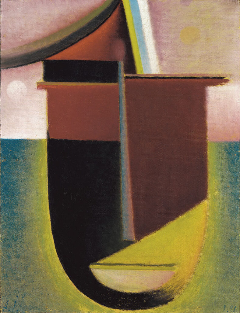
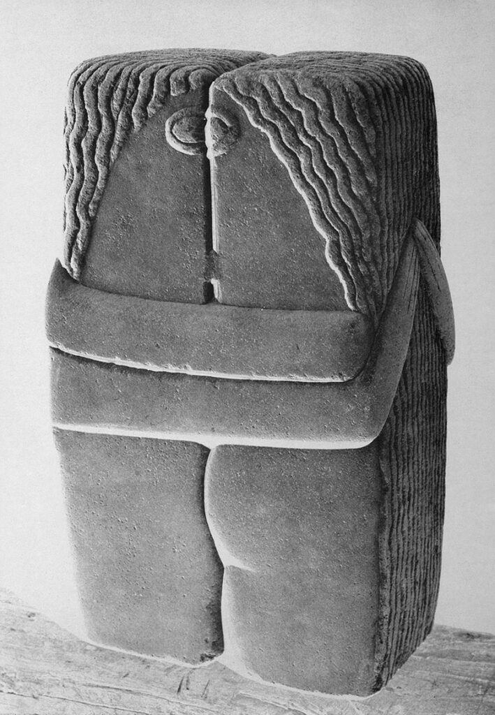
Ploeg’s work shows a great affinity with the avant-garde movements of the early 20th century, a period when artists arrived at the first abstract compositions via figuration. Some of his abstracted heads are reminiscent of the portraits of Alexej von Jawlensky (1864-1941), while the entwined heads (ill. p. 431) refer to the sculpture The Kiss (1916) by Constantin Brâncuși (1876-1957).
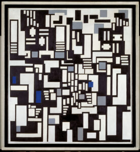
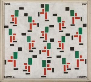
Ploeg revealed himself to be a typically Dutch artist in the similarities that some of his works bear to those of the group De Stijl, whose works are particularly well represented in modern art museums in the Netherlands. The Puzzle paintings are closely related to works such as Composition IX, Opus 18: Abstraction of The Card Players (1917) by Theo van Doesburg (1883-1931) (fig), and Composition II (Skaters) (1917) (fig) and Hammer and Saw (c.1917) by Vilmos Huszár (1884-1960) seem to belong to the same family as Ploeg’s Lettermen (sketches 23a, 30, 31, 34).
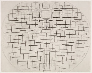
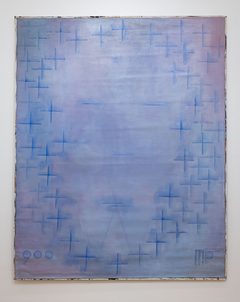
Like many other Dutch artists, Ploeg was unable to escape the shadow of Piet Mondrian (1872-1944). A particularly large canvas with deep-blue plus signs against a lighter blue-grey background refers to Mondrian’s Pier and Ocean series. The central part is left blank except for five minus signs, resulting in an image that resembles a large face with closed eyes. A black nine-panel work that is reminiscent of a starry sky also evokes associations with Mondrian’s Pier and Ocean series.[12]
In addition to the early-twentieth-century avant-garde, later influences can also be identified in Ploeg’s work, including repeated allusions to the American artist Philip Guston (1913-1980), who renounced abstraction in the 1960s in favour of figuration. For his illusionistic trompe-l’oeil paintings that suggest dents or folds in the canvas, Ploeg found his inspiration in the famous slash paintings of Lucio Fontana (1899-1968). These works connect with the traditions of abstract art while also ironically pointing to the destruction of the canvas.
COMPUTERS
It should come as no surprise that an artist who was so open to innovations in computer technology would also embrace the computer aesthetic. Some of Ploeg’s paintings are made up of blocks that can be seen as pixels (see SB E 01-03).
Ploeg’s computer prints are reminiscent of the prints of the artist and typographer Hendrik Nicolaas Werkman (1882-1945) who was involved in the resistance during the Nazi occupation of the Netherlands and paid with his life for his illegal printing activities. He left behind a rich oeuvre whose figures and colours exhibit great similarities with the work of Ploeg.
With the launch of the Amiga 500 computer in 1987, Ploeg began using it to make art. In 1989, he and Peter Mertens (1964) established the Medialab in what had previously been the audio-visual department at the Gerrit Rietveld Academy.
Of the 4096 colours the Amiga computer was capable of generating, only thirty-two could be displayed at one time. By using the computer program’s ‘gradient’ and ‘colorcycle’ functions, colours could change place smoothly, creating movement in the composition. Audio could also be added, resulting in moving paintings with sound. By recording the moving compositions, Ploeg was able to make films. Having already employed a variety of techniques to make programmes for his pirate channel PKP-TV, animations for VARA’s game show 2 voor 12 (2 For 12) and music videos for his bands, and having used television’s RGB colour model as the basis of his paintings, Ploeg was now in a position to fill the screen himself.
It is our hope that, through this exhibition, Maarten Ploeg’s oeuvre will receive more attention. His work is simple but certainly not banal. It is too elaborate, too ingenious, too curious and simply too well made for that. Noble simplicity, but with a high degree of deceit, because his work continues to surprise, both in terms of its imagery and its painterly qualities. It continues to move and fascinate us.
The nihilism of postmodernism is absent in Ploeg’s work and mentality, which bear witness to an inspiring enthusiasm. It is not for nothing that Ploeg was successful as a supervisor at the Rietveld Academy in Amsterdam from 1991 to 2002. It is striking that many of the characteristic elements of his work are to be found in the work of younger artists. His illusionistic, late paintings are echoed in the works of the American artist Tauba Auerbach (1981) and the Dutch artist Sarah Verbeek (1974). Even some of the animal figures of Tom Claassen (1964) seem to come close to those of Ploeg (SB D 15). The computer aesthetic that Ploeg explored in his Amiga prints (e.g. computer prints 18 and 20) has recently been increasingly apparent, for example in Auerbach’s work.
With visual intelligence and knowledge of modern American art history, Ploeg also forms a link in the Netherlands between the work of Morgan Betz (1974) and Bob Eikelboom (1991), artists who partly grew up in America and who combine the pop culture and visual language of the United States with European irony.
Looking back, we must conclude that, unlike his Dutch contemporaries, Ploeg distinguished himself by not denying abstraction, but by expanding it in new directions. He was not afraid of Mondrian’s shadow. And he dared to embrace digital art, taking paths that were avoided by others. He must be afforded a much greater role in the story of Dutch art of the 1980s. His humour, his embeddedness in modern art history and the layers in his work possess a seniority that, despite his relatively short career (comparable in that sense with Erik Andriesse (1957-1993) and René Daniëls), has given a strong impulse to the art of the 1980s and to the generation of artists that followed.
[1] For example, Kunstmuseum Den Haag has recently organised exhibitions of works by, among others, Walter Swennen (2021), Norbert Schwontkowski (2020), Emo Verkerk (2014) and Marthe Wéry (2011).
[2] Notable exhibitions in recent decades include Erik Andriesse (De Pont, Tilburg and Kunstmuseum Den Haag 2003), René Daniëls (Van Abbemuseum, Eindhoven, 2012), Stop Making Sense (group exhibition, Dordrechts Museum, Dordrecht, 2013), Marlene Dumas (Stedelijk Museum, Amsterdam, 2014), Emo Verkerk (Kunstmuseum Den Haag, 2014), Kees de Goede (De Pont, Tilburg, 2015), Frank van den Broeck (Central Museum, Utrecht 2019) and Rob Scholte (De Foundation, Zwolle, 2021).
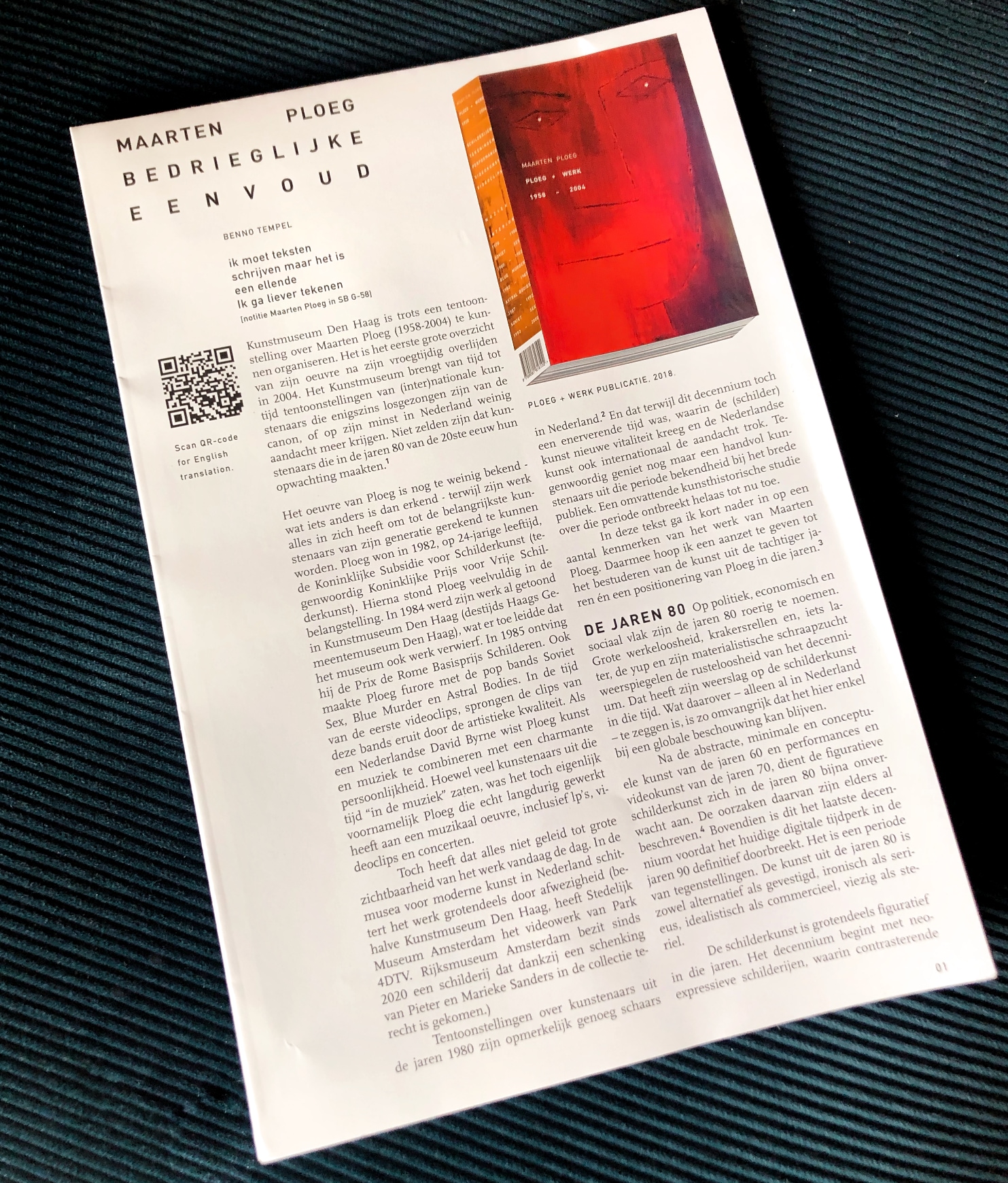
[3] An extensive overview of Maarten Ploeg’s activities can be found in the publication Maarten Ploeg 1958-2004: PLOEG + WERK, Amsterdam, 2018. The references to paintings in this text, can be found in “PLOEG + WORK”.
[4] Exh. cat., Stop Making Sense: Nederlandse schilderkunst in de jaren ‘80, Dordrechts Museum (Dordrecht) 2013-2014.
[5] Ibid, pp. 15 and 103.
[6] The VPRO devoted airtime to Maarten Ploeg on several occasions. In 1981, the programme BGTV broadcast an episode entitled ‘Over schilderen’ (About Painting) in which Ploeg and Klashorst discussed their work. In 1984, VPRO broadcast Rob Klaasman’s film Het nieuwe schilderen. Jonge Wilden, wat ouder (The New Paiting: The Young Savages, A Little Older).
[7] PLOEG + WERK, p. 495.
[8] Incidentally, from an international perspective, the use of text in images is perhaps one of the most characteristic elements of Neo-Expressionism and Postmodernism. A good example is the paintings of Jörg Immendorf. In the Netherlands, Emo Verkerk (1955) also has a clear interest in literature and language, mainly expressed in portraits of writers and thinkers.
[9] Exh. cat., René Daniëls, Stedelijk Van Abbemuseum (Eindhoven), Kunstmuseum Wolfsburg (Wolfsburg), Kunsthalle Basel (Basel), 1998-99, p. 74.
[10] Ibid., p. 73. Here the author gives an example of how Daniëls replaced a more descriptive yet nevertheless poetic title with a more enigmatic one.
[11] Ibid,, p. 144. In this respect, Daniëls’ work is closely related to Francis Picabia’s Transparancies.
[12] Incidentally, multi-panel works are rare in Dutch art of the 1980s. Erik Andriesse occasionally made one, as did the older artist Rob van Koningsbruggen (b. 1948). Ploeg made several triptychs, such as The Three Brothers, 1992, oil on canvas (ill. p. 430).
This text accompanies the exhibition Maarten Ploeg at the Kunstmuseum Den Haag from 25 February to 11 June 2023, curated by Benno Tempel and assisted by Renée Volkers. The museum is grateful to the lenders for entrusting their beloved works by Maarten Ploeg to the exhibition, which would not have been possible without the great knowledge and dedication of Ryu Tajiri, Rogier van der Ploeg and Martin Grootenboer.
EXHIBITION CREDITS
- Presentation of video clips: Martin Grootenboer and Rogier van der Ploeg.
- Conversion of Amiga Amos files: Wiel Seuskens.
ADDENDUM CREDITS
- Editor: Catherine Wolfs
- English translation: Gerard Forde
- Production: Ryu Tajiri / Maarten Ploeg Trust
- Installation photography: Alice de Groot / Kunstmuseum Den Haag
- Design: Willem Henri Lucas
- Printing: Drukkerij Tuijtel, Hardinxveld-Giessendam
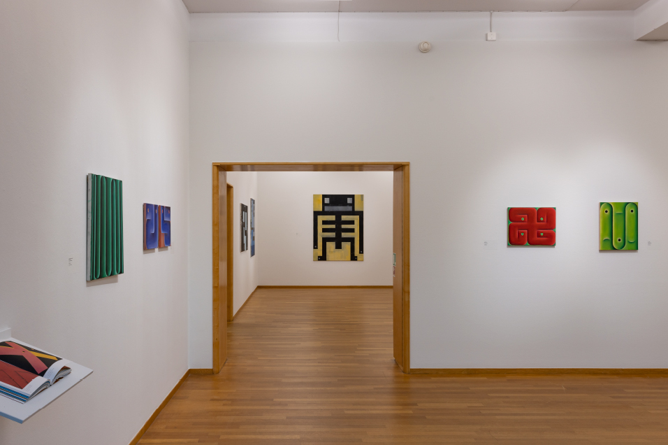
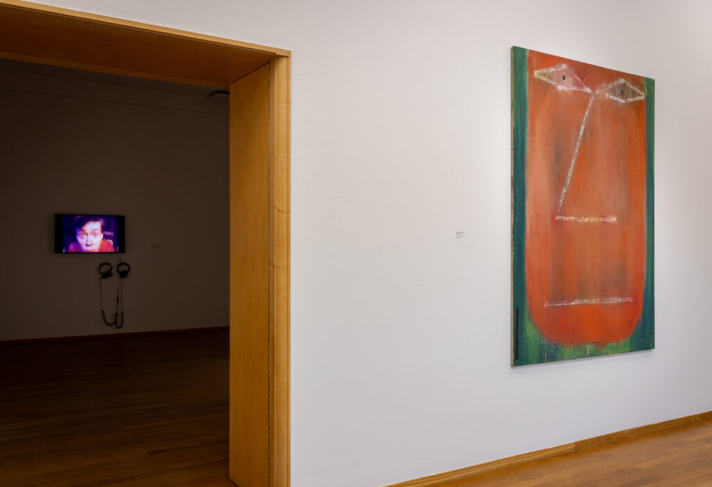
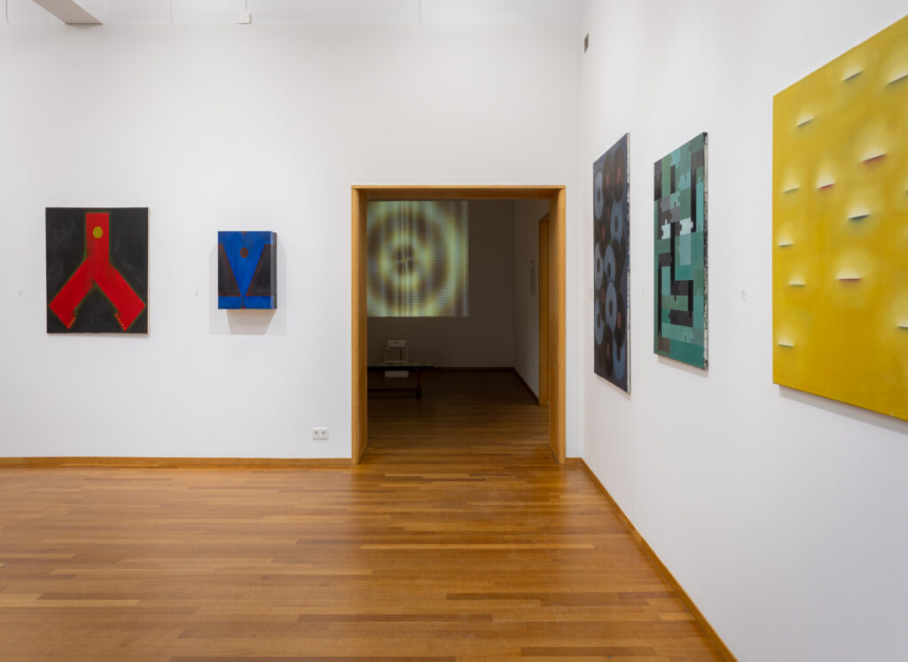
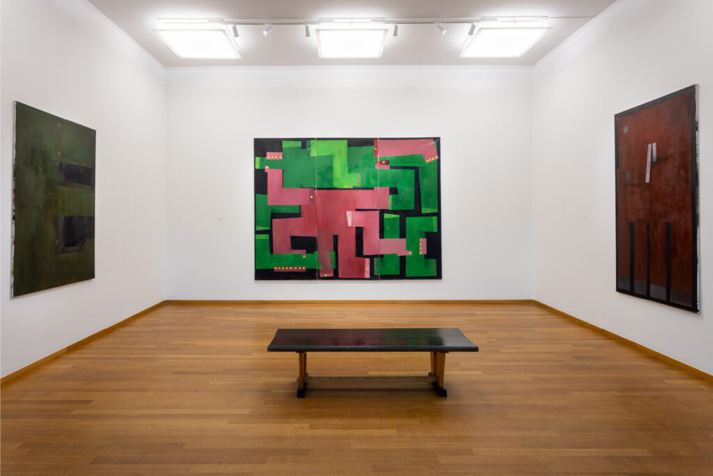
Exhibition View
Meanwhile you can buy the book for a limited time for a reduced price here
…